Inspired by Joanne Sharpe's LetterLove class! Lots of fun lettering and color. My favorite things!
Linking to sweet Sophia's Sunday Sketches. Please take a peek at what my brilliant artist friends have been up to this week!
Showing posts with label strathmore visual journals. Show all posts
Saturday, May 5, 2012
Friday, April 27, 2012
Defining My Style
I've been struggling lately, feeling a bit like a dilettante (well, a lot like a dilettante), playing with "artsy stuff" but to what end? I've always loved anything with a creative side and have picked up a number of "hobbies" throughout the years. I get all caught up in them, purchasing every art tool, medium, book and class to feed my obsession, but I have not ever really settled on just one thing, never really defined myself as an artist or created a signature style. I look at some of the artists who I gravitate toward and they all have a very distinctive style, even when they move outside their go-to medium, their style carries over and shines through.
In contrast, I feel like my style morphs with each new interest I have, each new class I take. I can't seem to decide whether I want to do lettering, watercolor painting, pencil sketching, portraits, landscapes, urban sketching, etc., etc., etc... Every time I see someone who does these things really well, it inspires me to want to try it. But when I focus on one or the other for too long, I start feeling uninspired, like I want to try new things.
Maybe there's nothing wrong with that. I'm not trying to foist my amateurish skills on an unsuspecting commercial audience-- although I've been tickled pink that I've had a few requests for that lately-- so maybe just following whatever interests me, without defining a style, is okay. Or maybe, someday, when I least expect it, I will be able to look at what I'm doing and see some sort of consistency, something that makes it mine.
In the meantime, I'm just going to continue learning as much as I can from those masters who inspire me. Right now, I'm doing that through Joanne Sharpe's Artful Alphabets class. Lots of great ideas from Joanne and a wonderful, sharing community of fellow students have me stuck on lettering right now. Here's my attempt to apply the lettering to something beyond just writing the alphabet (I've got my ABCs down pat now!).
And if you're looking for real inspiration, please check out what my friends at Paint Party Friday are up to this week, too!
In contrast, I feel like my style morphs with each new interest I have, each new class I take. I can't seem to decide whether I want to do lettering, watercolor painting, pencil sketching, portraits, landscapes, urban sketching, etc., etc., etc... Every time I see someone who does these things really well, it inspires me to want to try it. But when I focus on one or the other for too long, I start feeling uninspired, like I want to try new things.
Maybe there's nothing wrong with that. I'm not trying to foist my amateurish skills on an unsuspecting commercial audience-- although I've been tickled pink that I've had a few requests for that lately-- so maybe just following whatever interests me, without defining a style, is okay. Or maybe, someday, when I least expect it, I will be able to look at what I'm doing and see some sort of consistency, something that makes it mine.
In the meantime, I'm just going to continue learning as much as I can from those masters who inspire me. Right now, I'm doing that through Joanne Sharpe's Artful Alphabets class. Lots of great ideas from Joanne and a wonderful, sharing community of fellow students have me stuck on lettering right now. Here's my attempt to apply the lettering to something beyond just writing the alphabet (I've got my ABCs down pat now!).
And if you're looking for real inspiration, please check out what my friends at Paint Party Friday are up to this week, too!
Tuesday, February 14, 2012
Monday, February 13, 2012
Learning to love the pencil...
Okay, I have to admit that I'm starting to appreciate the pencil a bit more, if only for the fact that it allows me to do SOOOO much erasing and reworking (as can be seen from all the little erasure marks that I neglected to brush off the page before scanning).
Someone recently noted (I apologize for forgetting who) that the difference of a millimeter changes a face from beautiful to... not as beautiful in terms of proportion. Drawing these portraits has made me a true believer of that. Unbelievably, I have found that erasing from one side v. the other of a bold line makes all the difference in the world between making someone identifiable v. not. It's painstaking for someone who has not done this type of work before, but I love the fact that it's made me really tune into details. So, onward and upward, as the saying goes.
I can still see a lot of things I want to change... I'm going to walk away for a little while and come back to it with clearer eyes.
okay, okay, okay, okay, okay... my hubby is about ready to have me committed because I can't keep away... I keep tweaking and adjusting things that he says only I can see, which is probably true. But now I'm obsessed (as usual) and I can't stop fiddling with this.
Someone recently noted (I apologize for forgetting who) that the difference of a millimeter changes a face from beautiful to... not as beautiful in terms of proportion. Drawing these portraits has made me a true believer of that. Unbelievably, I have found that erasing from one side v. the other of a bold line makes all the difference in the world between making someone identifiable v. not. It's painstaking for someone who has not done this type of work before, but I love the fact that it's made me really tune into details. So, onward and upward, as the saying goes.
Oh, I also realized that I need to stick with floating heads for awhile. I tried filling in a neckine and jacket and it again just completely changed the look of it. I continue to be in awe of those people who can sit down and quickly sketch a completely recognizable character. Maybe one day...
Hmmm... I should upload things more often. It's amazing how seeing them on the screen allows me to see EVEN MORE of the imperfections. A slightly revised version below.
okay, okay, okay, okay, okay... my hubby is about ready to have me committed because I can't keep away... I keep tweaking and adjusting things that he says only I can see, which is probably true. But now I'm obsessed (as usual) and I can't stop fiddling with this.
One more time...
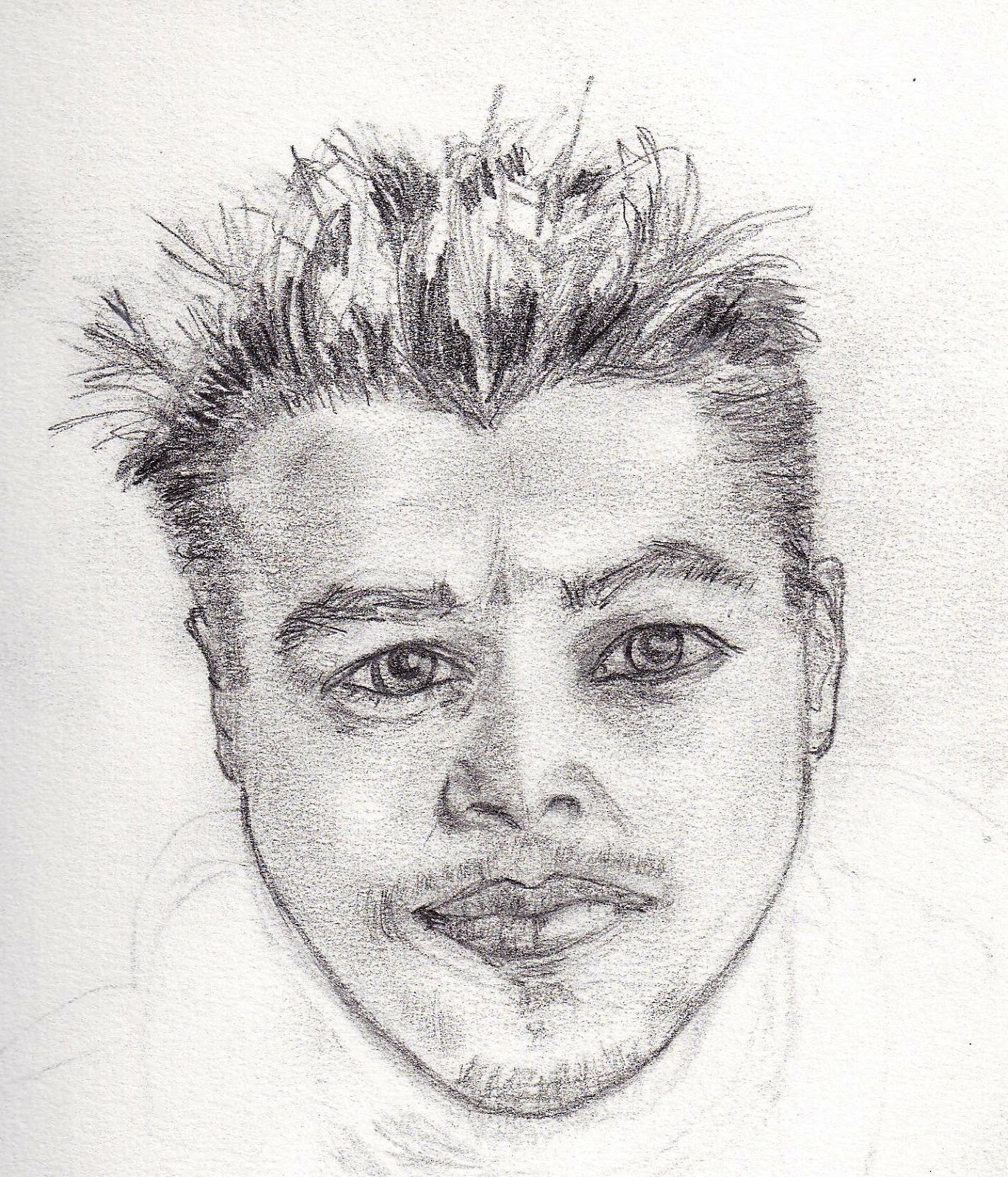
Yet another pencil portrait... I spent a litle more time with this one but I am struggling with making them feel alive. I know I need to work on the mechanics of proportion and features, etc... but I also wish that I could better capture the life behind the face. Ah well, back to the drawing board...
Sunday, February 12, 2012
Portrait in pencil
This time I attempted a portrait in pencil. I'm not sure I had any better luck but it definitely felt like a very different process. For whatever reason, I think I feel freer with a pen than with a pencil... which makes no sense since the pencil obviously allows a lot more room for corrections and working and reworking a sketch. Despite that, it feels confining to me. Maybe I just need to get more used to it.
The good news is that my hubby and daughter both recognized who I was trying to capture right away. Despite that, it still looks very cock-eyed and amateurish to me. I need to keep reminding myself that all those who make it look so effortlessly brilliant probably spent some time early on learning how to get past the pin it to the refrigerator/kindergarten look. :-)
portraits
I've always wanted to be able to draw portraits that actually look like people rather than just oddly pulled together sock puppets. This is my first attempt and I must admit, I find it very challenging but I'm going to keep plugging and see if it's possible to improve at all.
I did this in pen and I think I may try with pencil next time. Perhaps it will be more forgiving. :-)
Slide on over to Sophia's Sunday Sketches... You will surely find much inspiration there!
I did this in pen and I think I may try with pencil next time. Perhaps it will be more forgiving. :-)
Slide on over to Sophia's Sunday Sketches... You will surely find much inspiration there!
Wednesday, October 19, 2011
Art store finds
is there anything better than just meandering through your favorite art store, finding new things that you can't possibly live without? i must admit, most of my friends can wander through clothes stores or shoe stores until they can barely stand. i don't have the patience for that. but put me in a good bookstore (preferably, with a hot cup of coffee in hand) or an art store, filled with all those heady, artsy smells, and I can easily while away an afternoon-- or even a full day!
this past weekend, as i was meandering through one of my favorite local art stores, i came upon these itsy bitsy, teeny weeny visual journals from strathmore in three different types: 90 lb watercolor, 100 lb bristol-vellum and 140 lb watercolor. these tiny little gems are only 3.5" x 5" and were on sale for $2.50 each! i have to say, i'm loving them.
i don't know what it is about me but i am having a very hard time working in what seems to be everyone's favorite sketchbook-- the ~8x5" moleskin. while i love the idea of them, i find the size all wrong. it's as if it's not big enough to really spread out and get my doodle on and not small enough to force me to mentally restrict myself. I end up feeling like i don't have enough room. and the larger moleskin journals have paper that's just too thin for me to work on.
as counter-intuitive as it sounds, i rather like the teeny weeny 3x5 format of these little journals. they seem to make me less inhibited, since how much can you really screw up on something the size of a small index card?? and at 2.50 for a whole 'pad' full of watercolor pages, i don't mind screwing up a little anyway. as a result, i've had lots of fun just doodling to my heart's content and then playing with the bold colors of my dr. ph martin's watercolors. this one was done on the 90 lb. watercolor paper.
i also splurged on some pan pastels, which i've seen lori vleigen mention before in some of her lovely art. (i may need to stop looking at her posts-- she's far too inspiring!) i bought a set of only 5 and have played with them a little but must admit i like the vibrancy of my watercolors better. but, i think i might just need to experiment some more to figure out how to better blend with them.
i do like the fact that you can erase them... and create some interesting effects that way! definitely something i'll keep playing with!
hope everyone's having a great week. happy hump day!
this past weekend, as i was meandering through one of my favorite local art stores, i came upon these itsy bitsy, teeny weeny visual journals from strathmore in three different types: 90 lb watercolor, 100 lb bristol-vellum and 140 lb watercolor. these tiny little gems are only 3.5" x 5" and were on sale for $2.50 each! i have to say, i'm loving them.
i don't know what it is about me but i am having a very hard time working in what seems to be everyone's favorite sketchbook-- the ~8x5" moleskin. while i love the idea of them, i find the size all wrong. it's as if it's not big enough to really spread out and get my doodle on and not small enough to force me to mentally restrict myself. I end up feeling like i don't have enough room. and the larger moleskin journals have paper that's just too thin for me to work on.
as counter-intuitive as it sounds, i rather like the teeny weeny 3x5 format of these little journals. they seem to make me less inhibited, since how much can you really screw up on something the size of a small index card?? and at 2.50 for a whole 'pad' full of watercolor pages, i don't mind screwing up a little anyway. as a result, i've had lots of fun just doodling to my heart's content and then playing with the bold colors of my dr. ph martin's watercolors. this one was done on the 90 lb. watercolor paper.
hope everyone's having a great week. happy hump day!
Subscribe to:
Posts (Atom)